How to animate in Claude Design
A 43-second loop announcing the new GCDT website and app. It started from our design system and a set of still screens, came to life with one prompt and real device frames, then was polished with a round of comments.
 Robert Napier · 4 steps · 6 min read
Start with a style you like
Begin with a project or design styling you like. If you already have a design system, attach it. If you don't, you can create one first from your brand files, website or Figma.
Everything that follows references it, so the screens and the animation look on-brand without you describing colours or type in every prompt.
Create the still UIs
Next, design static screens that reflect the timeline or flow you expect the animation to follow, referencing the design system or project you're happy with.
Get the screens right while they're still, and add small mini animations to a few of them. It's much faster to fix a layout here than inside a moving film.
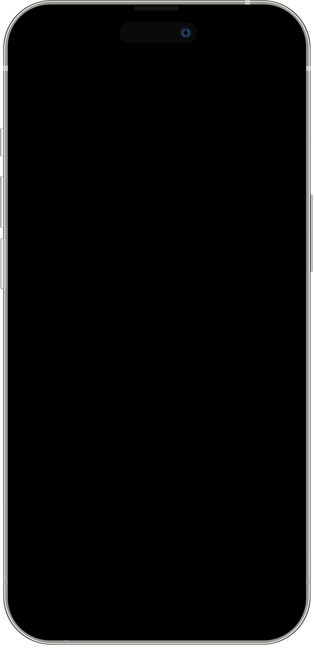
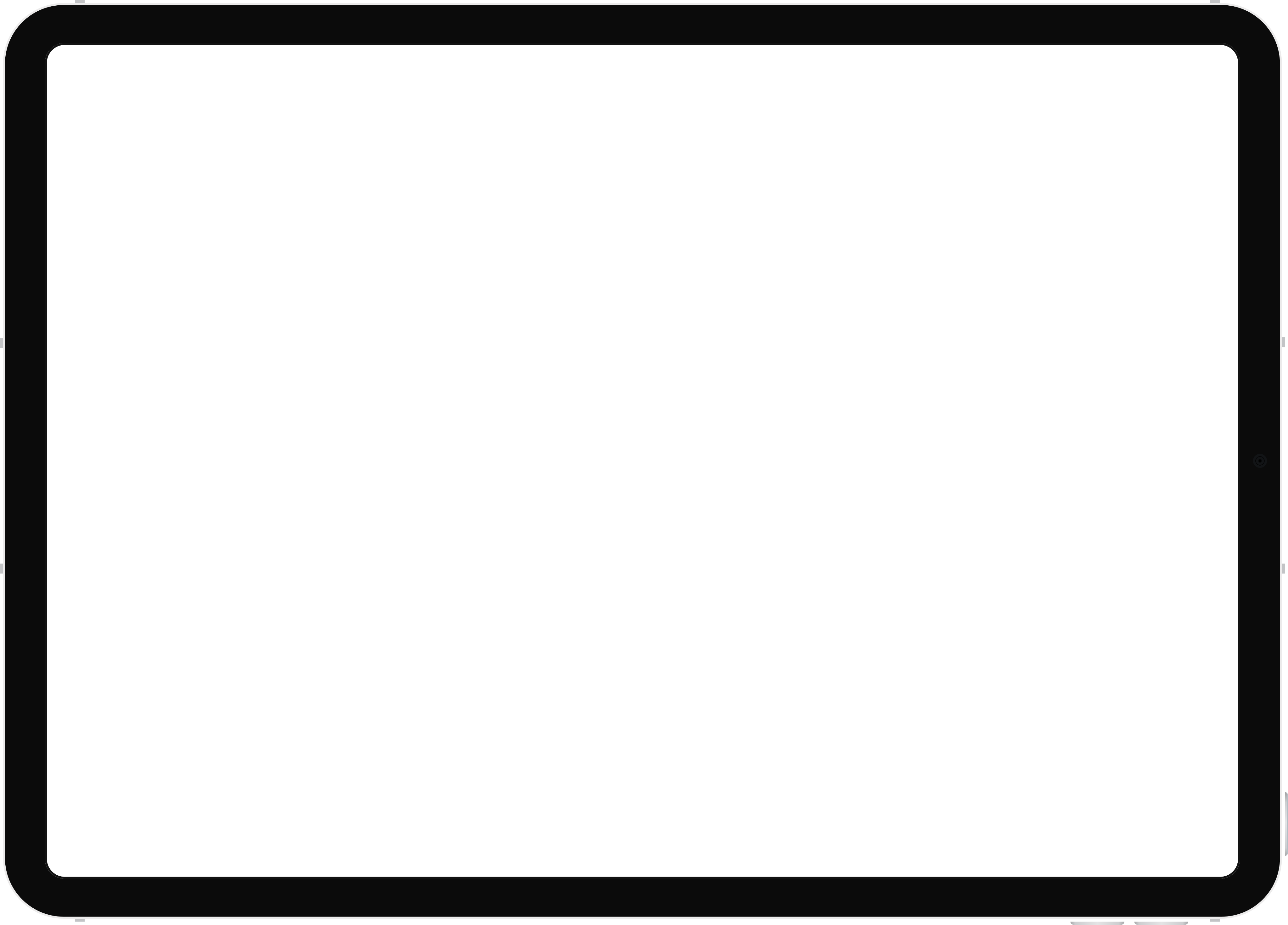
Use these device assets for the mobile and tablet frames.
Prompt the animation
Now for the animation. Write a prompt along the lines of the one below, which is the prompt for the film above. Describe the flow scene by scene, name the device for each scene, and say how you want the motion to feel.
I need to build a multi device animation that animates the UI like someone is using it, plus flourishes like confetti, to advertise the new Gold Coast Design Thinking website and app. This is roughly the timeline or flow I want it to take:
- Start on an iPad showing the About page, with the mission, job openings, next event, past events and partner logos flying in from outside the device and landing on the page, then transition to the app on mobile.
- On mobile, open the next event and check in, with confetti exploding out from the device, then switch to past events showing it as checked in, then move to the jobs board on desktop.
- On desktop, sign in, open Post a job, paste a link to the job ad so the details are pulled in automatically, then publish it and show the new listing landing on the board.
- Move to a mobile lock screen with notifications stacking in: an event reminder, a new job, a venue change and new event photos.
- Finish on an end card with our logo, “A new home for our design community” and Website, App and Coming soon capsules, then loop back to the start.
I want the UI filling out interactions to be a bit faster than normal. Have the devices floating at an angle, and make the transitions really slick, floating in and between each device. Use the GCDT design system throughout.
Before building the animation, let’s show some of the screens static, some with the mini animations.
Refine with comments
After the first version, every change was a short comment pinned to the element in the preview. Comments that didn't land were undone and reworded.
iPhone and tablet SVG assets
Upload device frames as SVGs so the screens render inside a real device. The iPhone frame is split in two, with the Dynamic Island as its own layer that sits above the screen.
Why animate in Claude Design
The film above isn't a video file. It's a web page that plays, which changes how you make it, publish it and keep it up to date.